Building a design system to elevate design maturity
#Branding
#Accessibility
#Government
View Figma Demo


Skip to
Overview
Role
User Experience Designer @ Publicis Sapient
Client
HRSA Data Warehouse (HDW)
Timeframe
5 months
Tools
Figma, Font Awesome
The Problem
No design system existed yet at HRSA Data Warehouse (HDW), which caused inefficiencies and a lot of design rework.
Research
Work was usually siloed, with limited collaboration between teams.
Varying layouts for topic landing pages
This meant users had to re-orient themselves whenever they viewed a different topic landing page. We identified a need for a template to address this design inconsistency.
I did a UI analysis of existing components and icons to identify reusable components.
Failure to meet basic accessibility guidelines
For a federal government site, it’s important to be 508-compliant. A design system can help address these issues by establishing default components and guidance to follow.


Missing labels for interactive fields
Labels or Instructions SC 3.3.2 (Level A)


Missing navigation buttons for carousel
Pause, Stop, and Hide SC 2.2.2 (Level A)


Missing or poor alt-text for images
Non-text Content SC 1.1.1 (Level A)
I identified WCAG (Web Content Accessibility Guidelines) Level A violations, which was helpful for referencing success criteria.
Ideation & Design
How might we create a design system that encourages adoption?
Stick to familiar branding
Deviating from HRSA branding was too much change at once. I presented mood boards to gauge the client’s preferences, and unsurprisingly, they were more comfortable with the familiar human-centric images typically displayed on HRSA sites.
I created two mood boards based off of stakeholder interviews to explore themes for the new design system.
Customize components and templates that complement a data-heavy site
To reduce design & development efforts, we first based our design system off of US Web Design System (USWDS).
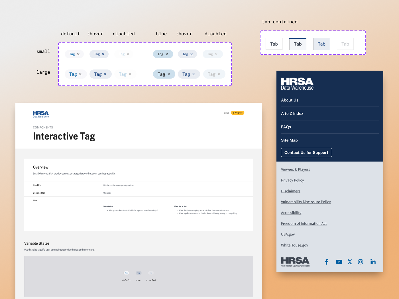
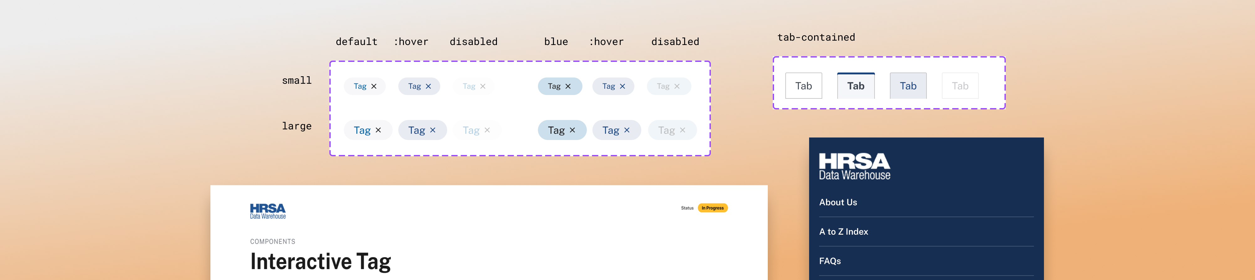
We expanded it further to include specific components for complex interfaces like HDW’s. I led the design of key components like Tags, Tabs, and the Dashboard Wrapper Template.
I designed simple and straightforward components since the content (e.g., data maps) already brought a lot of visual noise.
Results
A foundational design system ready for scaling efforts.
Unlocking a new stage of UX-Maturity
Before this project, the client lacked a design system, which resulted in major design inconsistencies. This new design system sets a solid foundation for future design implementations, and it can grow as the client grows.


Stage 3 - Emergent
Stage 4 - Structured
UX work is inconsistent or ineffective
UX is valued,
and there are standardized systems
I educated the client throughout this project, leading to increased design maturity.
This is a preview of our Figma design system: styles are not set up in the file, and it only showcases selected pages.
View Figma Demo


Building a design system to elevate design maturity
#Branding
#Accessibility
#Government
View Figma Demo
Skip to
Overview
Role
User Experience Designer @ Publicis Sapient
Client
HRSA Data Warehouse (HDW)
Timeframe
5 months
Tools
Figma, Font Awesome
The Problem
No design system existed yet at HRSA Data Warehouse (HDW), which caused inefficiencies and a lot of design rework.
Research
Work was usually siloed, with limited collaboration between teams.
This meant users had to re-orient themselves whenever they viewed a different topic landing page. We identified a need for a template to address this design inconsistency.
I did a UI analysis of existing components and icons to identify reusable components.
Varying layouts for topic landing pages
Failure to meet basic accessibility guidelines
For a federal government site, it’s important to be 508-compliant. A design system can help address these issues by establishing default components and guidance to follow.
Missing labels for interactive fields
Labels or Instructions SC 3.3.2 (Level A)
Missing navigation buttons for carousel
Pause, Stop, and Hide SC 2.2.2 (Level A)
Missing or poor alt-text for images
Non-text Content SC 1.1.1 (Level A)
I identified WCAG (Web Content Accessibility Guidelines) Level A violations, which was helpful for referencing success criteria.
Ideation & Design
How might we create a design system that encourages adoption?
Deviating from HRSA branding was too much change at once. I presented mood boards to gauge the client’s preferences, and unsurprisingly, they were more comfortable with the familiar human-centric images typically displayed on HRSA sites.
Stick to familiar branding
I created two mood boards based off of stakeholder interviews to explore themes for the new design system.
Customize components and templates that complement a data-heavy site
To reduce design & development efforts, we first based our design system off of US Web Design System (USWDS).
We expanded it further to include specific components for complex interfaces like HDW’s. I led the design of key components like Tags, Tabs, and the Dashboard Wrapper Template.
I designed simple and straightforward components since the content (e.g., data maps) already brought a lot of visual noise.
Results
A foundational design system ready for scaling efforts.
Unlocking a new stage of UX-Maturity
Before this project, the client lacked a design system, which resulted in major design inconsistencies. This new design system sets a solid foundation for future design implementations, and it can grow as the client grows.


Stage 3 - Emergent
Stage 4 - Structured
UX work is inconsistent or ineffective
UX is valued,
and there are standardized systems
I educated the client throughout this project, leading to increased design maturity.
This is a preview of our Figma design system: styles are not set up in the file, and it only showcases selected pages.
View Figma Demo
Building a design system to elevate design maturity
#Branding
#Accessibility
#Government
View Figma Demo
Skip to
- UI analysis
- Accessibility assessment
- Mood boards
- Customized components
- Design System
Overview
Role
User Experience Designer @ Publicis Sapient
Client
HRSA Data Warehouse (HDW)
Timeframe
5 months
Tools
Figma, Font Awesome
The Problem
No design system existed yet at HRSA Data Warehouse (HDW), which caused inefficiencies and a lot of design rework.
Research
Work was usually siloed, with limited collaboration between teams.
Varying layouts for topic landing pages
This meant users had to re-orient themselves whenever they viewed a different topic landing page. We identified a need for a template to address this design inconsistency.
I did a UI analysis of existing components and icons to identify reusable components.
Failure to meet basic accessibility guidelines
For a federal government site, it’s important to be 508-compliant. A design system can help address these issues by establishing default components and guidance to follow.
Missing labels for interactive fields
Labels or Instructions SC 3.3.2 (Level A)
Missing navigation buttons for carousel
Pause, Stop, and Hide SC 2.2.2 (Level A)
Missing or poor alt-text for images
Non-text Content SC 1.1.1 (Level A)
I identified WCAG (Web Content Accessibility Guidelines) Level A violations, which was helpful for referencing success criteria.
Ideation & Design
How might we create a design system that encourages adoption?
Stick to familiar branding
Deviating from HRSA branding was too much change at once. I presented mood boards to gauge the client’s preferences, and unsurprisingly, they were more comfortable with the familiar human-centric images typically displayed on HRSA sites.
I created two mood boards based off of stakeholder interviews to explore themes for the new design system.
I designed simple and straightforward components since the content (e.g., data maps) already brought a lot of visual noise.
Customize components and templates that complement a data-heavy site
To reduce design & development efforts, we first based our design system off of US Web Design System (USWDS).
We expanded it further to include specific components for complex interfaces like HDW’s. I led the design of key components like Tags, Tabs, and the Dashboard Wrapper Template.
Results
A foundational design system ready for scaling efforts.
Unlocking a new stage of UX-Maturity
Before this project, the client lacked a design system, which resulted in major design inconsistencies. This new design system sets a solid foundation for future design implementations, and it can grow as the client grows.
Stage 3 - Emergent
Stage 4 - Structured
UX work is inconsistent or ineffective
UX is valued,
and there are standardized systems
I educated the client throughout this project, leading to increased design maturity.
This is a preview of our Figma design system: styles are not set up in the file, and it only showcases selected pages.
View Figma Demo