

Skip to
Overview
Role
User Experience Designer @ Publicis Sapient
Client
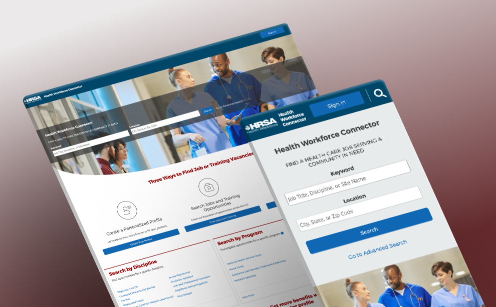
HRSA Health Workforce Connector (HWC)
Timeframe
3 months
Tools
Axure RP, Mural, Icons8, ShutterStock
The Problem
The Health Workforce Connector (HWC)’s landing page needed to reflect its purpose and value for job-seekers.
Research
The current landing page didn’t look like traditional career sites.
Opportunity to highlight HWC’s competitive edge
HWC still has market share because it’s a unique job site that connects health professionals to health facilities that participate in HRSA programs. It directly partners with 50k+ health facilities.

Health Workforce Connector
Other job sites


Search for jobs

No HRSA programs
Search for jobs
Has HRSA programs
I conducted competitive analysis of job-seeking sites.
Ideation & Design
How might we highlight features and resources?
Refine content and copy with close collaboration
I presented two high-fidelity desktop mockups to spark discussions about what the new landing page should prioritize. Afterwards, I led a Mural design workshop with 10 stakeholders to collect feedback on a new testimonial section.
Idea 1
I brainstormed layouts that emphasized ways users can search for jobs (e.g., Search by Discipline).
Stakeholders wanted to replace the numbers section with testimonials.
Idea 2
I explored illustrations for the image assets, which aligned with visuals commonly used on job-seeking platforms.
Stakeholders wanted to move the job listings section farther down the page.

SR
Stakeholder 1
3:37 PM
I like both views.

SR
Stakeholder 2
3:39 PM
That guide is fantastic

SR
Stakeholder 3
3:39 PM
Both options look great
Overall, I received a lot of good feedback from stakeholders.
Give visitors a preview of the platform
Since HWC job listing cards didn’t follow common card templates, it needed to give more guidance for new visitors. This section repurposed existing resources to reduce work efforts.
I introduced a guide section and designed the accompanying graphic.
Build trust with consistent icons
The current icons lacked consistency and were too complex. I followed another HRSA designer’s icon guidelines to ensure consistency across the modernization efforts.
I selected icons that removed unnecessary visual weight.
Results
A new landing page to convert visitors into users.
2.1M
site visitors per year
105K
users per year
20K
job connections per year
This reflects site usage before the redesign — Data as of Nov. 2022
This set the tone for future modernization efforts
Before the redesign, only ~5% of visitors converted into users. With over 2M annual visitors, even a 1% increase in conversion would translate into 20,000 additional users per year. The completion of this project was a high-impact opportunity to improve the site’s branding and value.
Before
After
View Live Site


Skip to
Overview
Role
User Experience Designer @ Publicis Sapient
Client
HRSA Health Workforce Connector (HWC)
Timeframe
3 months
Tools
Axure RP, Mural, Icons8, ShutterStock

The Problem
The Health Workforce Connector (HWC)’s landing page needed to reflect its purpose and value for job-seekers.
Research
The current landing page didn’t look like traditional career sites.
Opportunity to highlight HWC’s competitive edge
HWC still has market share because it’s a unique job site that connects health professionals to health facilities that participate in HRSA programs. It directly partners with 50k+ health facilities.

Health Workforce Connector
Other job sites

Search for jobs
No HRSA programs
Search for jobs
Has HRSA programs
I conducted competitive analysis of job-seeking sites.
Ideation & Design
How might we highlight features and resources?
Refine content and copy with close collaboration
I presented two high-fidelity desktop mockups to spark discussions about what the new landing page should prioritize. Afterwards, I led a Mural design workshop with 10 stakeholders to collect feedback on a new testimonial section.
Idea 1
I brainstormed layouts that emphasized ways users can search for jobs (e.g., Search by Discipline).
Stakeholders wanted to replace the numbers section with testimonials.
Idea 2
I explored illustrations for the image assets, which aligned with visuals commonly used on job-seeking platforms.
Stakeholders wanted to move the job listings section farther down the page.
SR
Stakeholder 1
3:37 PM
I like both views.
SR
Stakeholder 2
3:39 PM


2

1
That guide is fantastic
SR
Stakeholder 3
3:39 PM
Both options look great

SR
Stakeholder 4
3:40 PM
3
2
Love that Guide - it’s hard to make our lingo accessible to users!

SR
Stakeholder 5
3:51 PM
1
I really like the second wireframe. The content is great!
Overall, I received a lot of good feedback from stakeholders.
Give visitors a preview of the platform
Since HWC job listing cards didn’t follow common card templates, it needed to give more guidance for new visitors. This section repurposed existing resources to reduce work efforts.
I introduced a guide section and designed the accompanying graphic.
Build trust with consistent icons
The current icons lacked consistency and were too complex. I followed another HRSA designer’s icon guidelines to ensure consistency across the modernization efforts.
I selected icons that removed unnecessary visual weight.
Results
A new landing page to convert visitors into users.
2.1M
site visitors per year
105K
users per year
20K
job connections per year
This reflects site usage before the redesign — Data as of Nov. 2022
This set the tone for future modernization efforts
Before the redesign, only ~5% of visitors converted into users. With over 2M annual visitors, even a 1% increase in conversion would translate into 20,000 additional users per year. The completion of this project was a high-impact opportunity to improve the site’s branding and value.
Before
After
View Live Site
Skip to
- Competitor analysis
- Requirements gathering
- High-fidelity mockups
- Prototyping
- Design Workshop
- Tech validation
- Responsive landing page
Overview
Role
User Experience Designer @ Publicis Sapient
Client
HRSA Health Workforce Connector (HWC)
Timeframe
3 months
Tools
Axure RP, Mural, Icons8, ShutterStock
The Problem
The Health Workforce Connector (HWC)’s landing page needed to reflect its purpose and value for job-seekers.
Research
The current landing page didn’t look like traditional career sites.
Opportunity to highlight HWC’s competitive edge
HWC still has market share because it’s a unique job site that connects health professionals to health facilities that participate in HRSA programs. It directly partners with 50k+ health facilities.
Health Workforce Connector
Other job sites
Search for jobs
No HRSA programs
Search for jobs
Has HRSA programs
I conducted competitive analysis of job-seeking sites.
Ideation & Design
How might we highlight features and resources?
Refine content and copy with close collaboration
I presented two high-fidelity desktop mockups to spark discussions about what the new landing page should prioritize. Afterwards, I led a Mural design workshop with 10 stakeholders to collect feedback on a new testimonial section.
Idea 1
I brainstormed layouts that emphasized ways users can search for jobs (e.g., Search by Discipline).
Stakeholders wanted to replace the numbers section with testimonials.
Idea 2
I explored illustrations for the image assets, which aligned with visuals commonly used on job-seeking platforms.
Stakeholders wanted to move the job listings section farther down the page.
SR
Stakeholder 1
3:37 PM
I like both views.
SR
Stakeholder 2
3:39 PM
2
1
That guide is fantastic
SR
Stakeholder 3
3:39 PM
Both options look great
SR
Stakeholder 4
3:40 PM
3
2
Love that Guide - it’s hard to make our lingo accessible to users!
SR
Stakeholder 5
3:51 PM
1
I really like the second wireframe. The content is great!
Overall, I received a lot of good feedback from stakeholders.
Give visitors a preview of the platform
Since HWC job listing cards didn’t follow common card templates, it needed to give more guidance for new visitors. This section repurposed existing resources to reduce work efforts.
I introduced a guide section and designed the accompanying graphic.
Build trust with consistent icons
The current icons lacked consistency and were too complex. I followed another HRSA designer’s icon guidelines to ensure consistency across the modernization efforts.
I selected icons that removed unnecessary visual weight.
Results
A new landing page to convert visitors into users.
2.1M
site visitors per year
105K
users per year
20K
job connections per year
This reflects site usage before the redesign — Data as of Nov. 2022
This set the tone for future modernization efforts
Before the redesign, only ~5% of visitors converted into users. With over 2M annual visitors, even a 1% increase in conversion would translate into 20,000 additional users per year. The completion of this project was a high-impact opportunity to improve the site’s branding and value.
Before
After
View Live Site